KOFICE CI
Korean Foundation for International Cultural Exchange (KOFICE) is engaged in future-oriented activities such as cultural exchange, research projects, and the creation of an international cultural network with countries around the world.
The design, based on the alphabet 'K,' integrates the structure of a person (人), the jeogori (top jacket) of a hanbok (traditional Korean clothing), and the directionality of a mouse pointer (representing the global network) into a single geometric system, symbolically capturing the brand's identity: "Korean culture connects with the world through its people."
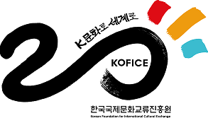
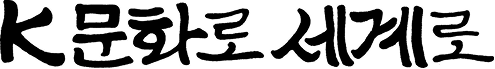
The emblem and slogan commemorating the 20th anniversary were created by the "Calligraphy Artist Kang Byung-in." The aim was to promote the beauty of Hangeul typography through meotgeulssi (calligraphy), which combines calligraphy and design.
Brand Concept
Human(人)
Hanbok(Jeogori Goreum)
Network(Mouse Pointer)
KOFICE CI
20th Anniversary Emblem
Slogan

The colors differ between the RGB display and CMYK print versions. For printing purposes, please download the CI file (AI Download) located above.
The Korea Foundation for International Cultural Exchange's "20th Anniversary Emblem and Slogan" creative work may be used under the terms of the KOGL Type 4 (Attribution - Non-Commercial - No Derivatives).